Income Trends
Income is the annual total amount of money an individual earns in a year before taxes, including money from wages and salaries, self-employment, interest, dividends, rent, and government cash transfers. It does not include nonwage compensation such as the value of health insurance. For all but the top 1 percent of households, the majority of income comes from wages.51Whereas, before taxes and transfers in 2017, labor income made up 61 percent of total income for the lowest income quintile, 68 percent of income for the middle three quintiles, and 70 percent for those in the 81st to 99th percentiles, labor income accounted for only one-third of income for the top 1 percent of earners. See The Distribution of Household Income, 2017 (Congressional Budget Office) for more information.
In the U.S., many jobs are low paid, and many workers earn at or below poverty incomes. Table 3 shows the fifteen largest occupations in the U.S., the number of workers in each occupation, their median hourly wage, and their median annual income.52Occupational Employment Statistics. 2020. May 2019 National Occupational Employment and Wage Estimates United States. U.S. Bureau of Labor Statistics.
Table 3. Employment and Median Hourly Wages in the Largest U.S. Occupations, May 2019
| Occupation | Employment | Median Hourly Wage | Median Annual Income |
| Retail salespersons | 4,317,950 | 12.14 | 25,250 |
| Fast food and counter workers | 3,996,820 | 10.93 | 22,740 |
| Cashiers | 3,596,630 | 11.37 | 23,650 |
| Home health and personal care aides | 3,161,500 | 12.15 | 25,280 |
| Registered nurses | 2,982,280 | 35.24 | 73,300 |
| Office clerks, general | 2,956,060 | 16.37 | 34,040 |
| Laborers and freight, stock, and material movers, hand |
2,953,170 | 14.19 | 29,510 |
| Customer service representatives | 2,919,230 | 16.69 | 34,710 |
| Waiters and waitresses | 2,579,020 | 11.00 | 22,890 |
| General and operations managers | 2,400,280 | 48.45 | 100,780 |
| Janitors and cleaners, except maids and housekeeping cleaners |
2,145,450 | 13.19 | 27,430 |
| Stockers and order fillers | 2,135,850 | 13.16 | 27,380 |
| Secretaries and administrative assistants, except legal, medical, exec. |
2,038,340 | 18.12 | 37,690 |
| Heavy and tractor-trailer truck drivers | 1,856,130 | 21.76 | 45,260 |
| Bookkeeping, accounting, and auditing clerks | 1,512,660 | 19.82 | 41,230 |
Many of these very large occupations (shaded) pay less than $15 per hour at the median, which for a full-time (forty hours per week), full-year (fifty-two weeks per year) worker is $31,200. Given that many full-time workers do not have paid vacation or sick leave, $31,200 is a maximum; it is only feasible if the worker does not miss a single hour of work in the year. For that reason, that maximum is often well above what most of these workers take home, as shown in the final column.53As of March 2020, 88 percent of full time, nonfederal employees have access to paid sick leave. Of this population, 87 percent have access to paid vacations, but only 25 percent have access to paid family leave. Access rates are significantly lower for part-time workers. (U.S. Bureau of Labor Statistics, 2020). For reference, the official federal poverty threshold for a family of four in 2019 was $25,750.54Assistant Secretary for Planning and Evaluation. 2019 Poverty Guidelines. U.S. Department of Health and Human Services. In total, at least 46.5 million workers are in occupations that pay below $15 per hour at the median.55The median annual earnings for an additional 1.4 million workers are less than $31,200—the earnings of a full-time, full-year worker at $15 per hour. The Occupational Employment and Wage Statistics does not offer median wage data for these occupations (“teaching assistants, except postsecondary”; “legislators”; and “umpires, referees, and other sports officials”). This number represents almost a third of all employees in the U.S.56This total excludes self-employed workers, who are not employees.
The large number of workers in jobs with low expected wages is the result of years of weak, or negative, wage growth. Figure 257Gould, Elise. 2020. State of Working America Wages 2019. Figure C. Economic Policy Institute. shows the change in real (adjusted for inflation) wages at different points of the wage distribution.58There are one hundred points, or percentiles, in a distribution. The wage distribution is the wages of each worker in the U.S., ranked from least to most; this can be conceptualized as a line of workers arranged from lowest earning to highest earning. If there were one hundred people in a line, wages at the 10th percentile are the earnings of the tenth person in line, and not the wages of that person and the nine people below him. Therefore, the 10th percentile earner is the highest earner among the ten lowest.
Figure 2. Cumulative Change in Real Hourly Wages of Workers, by Wage Percentile, 1979-2019
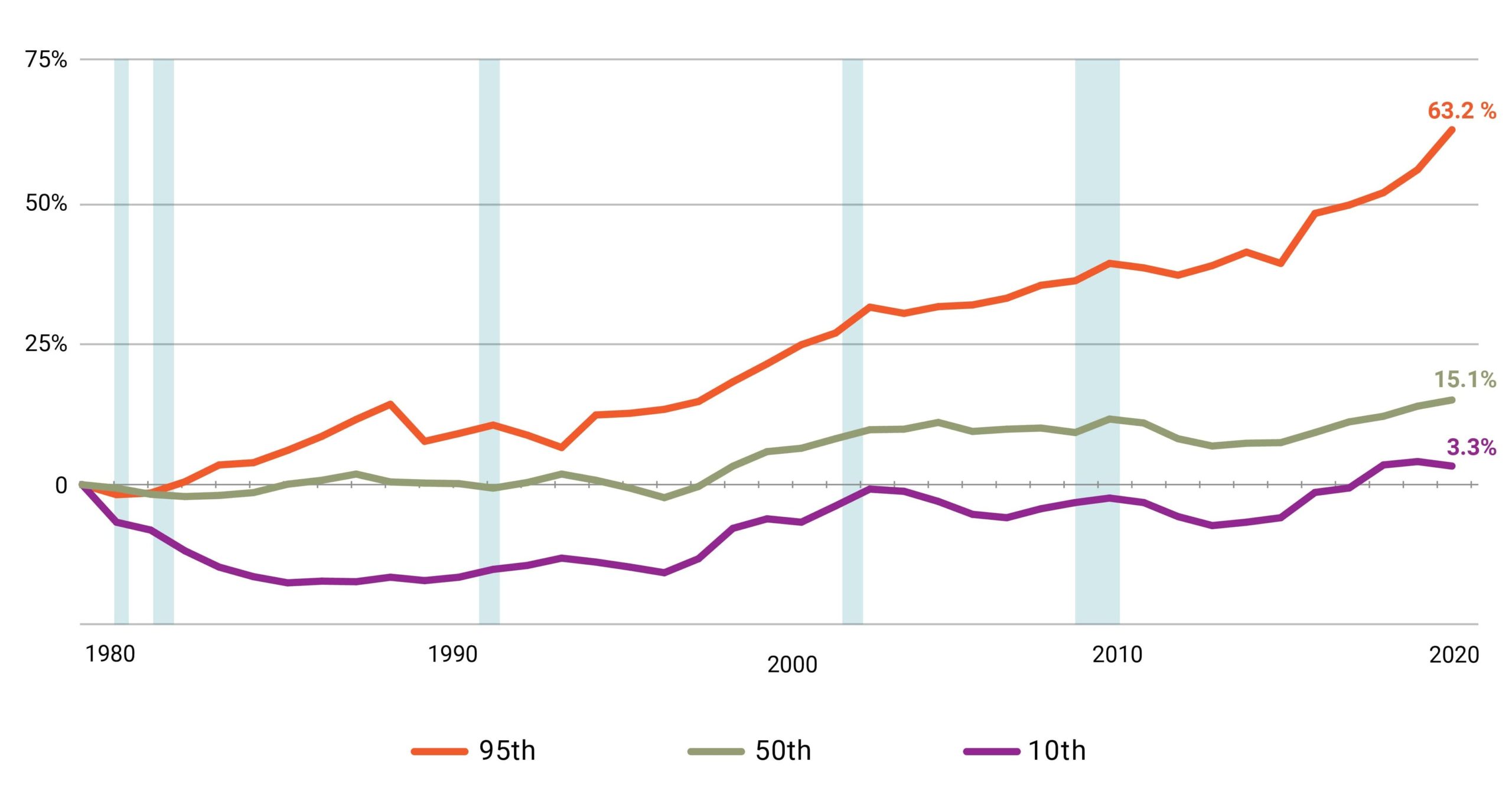
Notes: Shaded areas denote recessions. the xth-percentile wage is the wage at which x% of wage earners earn less and (100-x)% earn more.
Source: Elise Gould’s analysis of EPI Current Population Survey Extracts, Version 1.0 (2020), https://microdata.epi.org
At the bottom, workers at the 10th percentile did not see a real wage increase for the thirty-seven-year period from 1979 to 2016. Finally, in 2017—after eight years of GDP growth following the Great Recession—the 10th percentile experienced an increase in real wages relative to 1979 of about 3 percent. Over a forty-year period, this group observed a raise of 32 cents—from $9.75 to $10.07.59Economic Policy Institute. 2019. State of Working America Data Library. Wages by percentile and wage ratios. Original data from the Current Population Survey Outgoing Rotation Group microdata. Workers at the median wage experienced higher, but still relatively anemic, growth in wages after 1996, reaching $19.33 in 2019. Researchers point out that weak growth in wages has occurred despite overall increases in labor productivity, but there is debate as to why that is the case.60Whether there is a causal link between worker productivity and worker pay, and what is causing weak wage growth, are both topics of intense scrutiny among researchers. Summers and Stansbury 2017 find a strong and positive causal relationship between productivity and compensation, arguing that “other orthogonal factors are likely to be responsible for creating the wedge between productivity and pay in the US economy, suppressing typical workers’ incomes even as productivity growth acts to increase them.” Summers and Stansbury 2018 summarize in detail the existing literature around the productivity-compensation gap:
Computerisation and automation have been put forward as causes of rising mean-median income inequality (e.g. Autor et al. 1998, Acemoglu and Restrepo 2017); and automation, falling prices of investment goods, and rapid labour-augmenting technological change have been put forward as causes of the fall in the labour share (e.g. Karabarbounis and Neiman 2014, Acemoglu and Restrepo 2016, Brynjolffson and McAfee 2014, Lawrence 2015).
At the same time, non-purely technological hypotheses for rising mean-median inequality include the race between education and technology (Goldin and Katz 2007), declining unionisation (Freeman et al. 2016), globalisation (Autor et al. 2013), immigration (Borjas 2003), and the ‘superstar effect’ (Rosen 1981, Gabaix et al. 2016). Non-technological hypotheses for the falling labour share include labour market institutions (Levy and Temin 2007, Mishel and Bivens 2015), market structure and monopoly power (Autor et al. 2017, Barkai 2017), capital accumulation (Piketty 2014, Piketty and Zucman 2014), and the productivity slowdown itself (Grossman et al. 2017).
Benmelech et al. 2018 also discuss the extent to which labor market concentration may contribute to wage stagnation.
This stall in wage growth is similarly reflected in income growth. Figure 3 shows real (adjusted for inflation) pre-tax income growth from 1968 to 201961We show the full series, starting with the first available year. Income at key percentiles of the distribution is estimated and published annually by the Census Bureau. Wages are not. They must be estimated from the raw Census data from the Current Population Survey. Survey methodological changes mean that most wage series start, at the earliest, in 1975. from households at key points of the distribution.62DQYDJ. 2020. Household Income by Year: Average, Median, One Percent (and a Percentile Calculator). “Income” in Figures 3 through 6 refers to all pre-tax cash income, including sources of unearned income; it excludes the value of noncash transfers such as benefits from SNAP and post-tax cash transfers such as benefits from the EITC.
Figure 3. Pre-Tax Household Income by Percentiles and Average Income in 2020 Dollars, 1968–2019
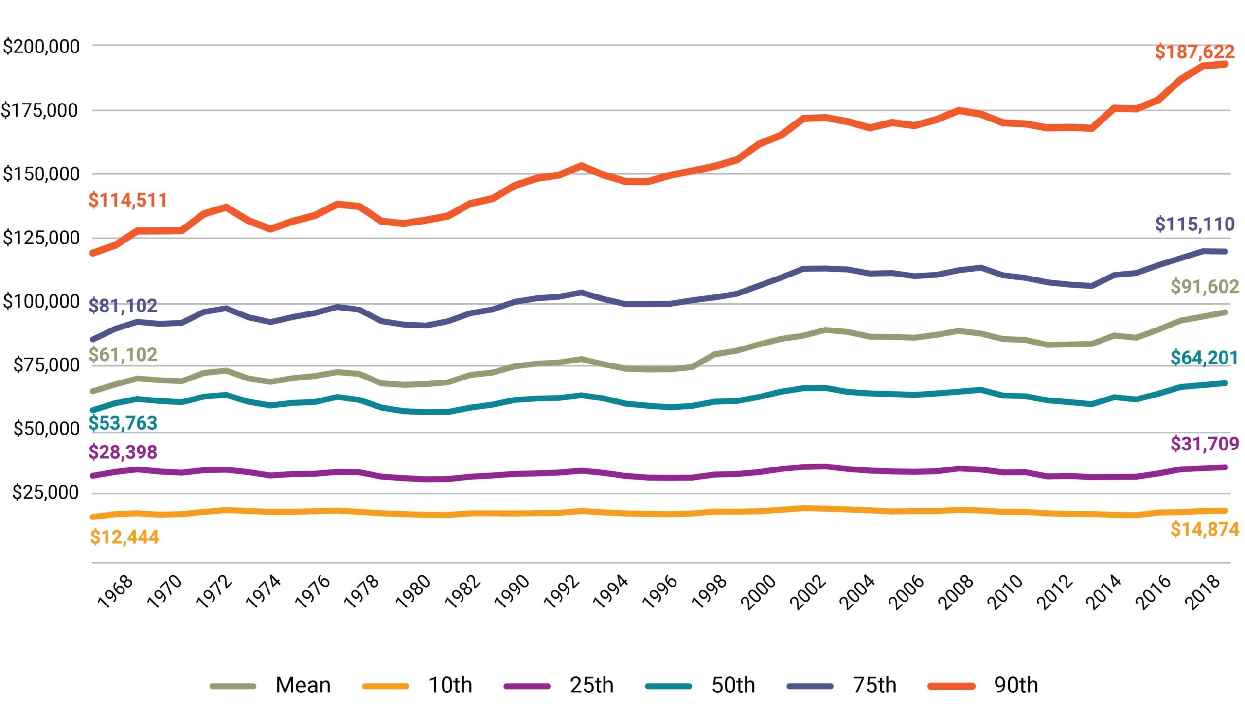
At the bottom, the 10th percentile household real income in 1968 was $12,444, and it grew to $14,874 in 2019, an increase of about $2,500 over fifty years (a 19.5 percent increase). The 25th percentile had a similarly small gain of $3,300 (an 11.7 percent increase), and incomes at the median had a gain of about $10,400 (a 19.4 percent increase). Both Figures 2 and 3 depict income growth at the bottom and median as slow or even negligible in recent history.
These figures are not comparing a single person over time, but rather, people of the same relative wage or same relative income at different points in time. Slow growth at the bottom of the wage or income distribution would be less problematic if most workers did not stay at that wage or income for long. For instance, most people earn their lowest wage in their first job because they are young and do not have any experience and earn more as they accrue more experience. A person may start at the 35th percentile but retire at the 85th. Studies of lifetime earnings, however, are pessimistic. Even when looking at the total a person earns over their career, the growth in income and wages of workers in the bottom half of the distribution is small, especially in comparison to the top end of the distribution.63Leonesio and Del Bene 2011 find that, using data from 1981 to 2004, the earnings trajectory of male workers at the 50th income percentile or below is declining over time. For female workers during this period, earnings trajectories increased at each income percentile, though by substantially larger magnitudes as one moves up the income scale. Kopczuk and Saez 2010 “find that long-term mobility measures among all workers… display significant increases since 1951 either when measured unconditionally or when measured within cohorts. However, those increases mask substantial heterogeneity across gender groups. Long-term mobility among males has been stable over most of the period with a slight decrease in recent decades. The decrease in the gender earnings gap and the resulting substantial increase in upward mobility over a lifetime for women is the driving force behind the increase in long-term mobility among all workers.” Table 1 in Auten, Gee, and Turner 2013 shows that, of taxpayers in the bottom income quintile in 1987, 52 percent remained in the bottom quintile in 2007 and an additional 23 percent had incomes in the second quintile.
Slow growth at the bottom of the wage or income distribution would also be less problematic if income at the top of the distribution only grew apace.64In other words, lack of growth at the bottom of the distribution would not be as noteworthy if there was not growth (especially high levels of growth) at upper portions of the distribution. Instead, growth at the top was much faster than growth at the bottom. At the 90th percentile (or the bottom end of the highest earning 10 percent), wages grew by 44.3 percent between 1979 and 2019 compared to 3.3 percent for the 10th percentile. Over the same period income, at the 90th percentile increased by $54,000, or 40.7 percent, compared to a 0.4 percent decline at the 10th percentile (see figure 3).
Income inequality is not a constant in the U.S. economy, and evidence suggests that it has worsened over the past forty years. Figure 4 shows the income shares of the top 10 percent of households since 1917, or how much of all income in the U.S. was taken home by the top 10 percent of households in the income distribution.65Saez, Emmanuel. 2020. Striking It Richer: The Evolution of Top Incomes in the United States (Updated with 2018 Estimates). Figure 1.
Figure 4. Share of Total Income Taken Home by Top 10 Percent of Households Prior to Taxes and Transfers, 1917–2018 66Capital gains are income from the profit on a sale of an asset. Typically these include stocks, bonds, real estate, or a business. As noted earlier in this section, the wealthiest households in the U.S. tend to have disproportionate income shares as capital gains relative to the rest of the population (see footnote 51).
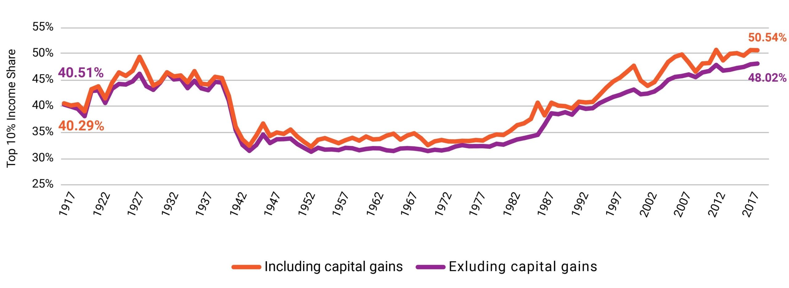
The ten years preceding the Great Depression saw growing income concentration. During the Depression, the top 10 percent income share held steady at 45 percent and then fell beginning in 1940. For the next four decades, the top ten percent of the distribution took home a third of all income. Starting in the late 1970s, the share going to the bottom 90 percent steadily eroded until, in 2012, more than half of all income went to the top ten percent of households. Put another way, the total income of the bottom 90 percent was less than the total income of the top 10 percent. Not only does this show the increase in income accruing to the highest earners but also that this trend is recent and not a permanent or necessary feature of the U.S. economy.67Income shares, shown in Figure 4, are not the only measure of income equality. There are also income ratios, the Gini coefficient, and others. They each show an increase in income inequality since the mid-1970s.Researchers have compiled an incredible library of resources to graphically depict the extent of inequality. The Economic Policy Instituteand Inequality.org offer interactive charts that help show changes in the distribution of wealth and income over the past decades in the U.S. The World Inequality Database offers similar charts from nearly every country in the world. Some of the more prominent economists who have written on inequality recently include Joseph Stiglitz, Heather Boushey, Thomas Piketty, Alan Krueger, and James Heckman. This Center on Budget and Policy Priorities report discusses how inequality is measured and the various sources of data.
It is not clear what the relationship is between economic inequality and economic insecurity. Slow income growth for the bottom half of households does not necessarily mean that they are all economically insecure. And importantly, inequality is a result, not a cause. It is a summary of the income distribution. At the very least, income inequality greatly curtails the gains in average economic status among the population and demonstrates that not all households share in those gains.
To explore that disparity, we examine two traditional channels of attaining economic security: buying a home and going to college, the former being an asset that provides security and the latter a means of attaining higher income. Figure 5 shows the growth in the median sale price of a new home and median income in nominal dollars—that is, the actual dollar amount not adjusted for the average change in prices over time.68Source (median price of a new home): U.S. Census Bureau. 2020. New Residential Sales. Median and Average Sale Price of Houses Sold.Source (median income in nominal dollars): U.S. Census Bureau. 2020. Historical Income Tables: Households. Table H-6. The dollars are not adjusted because Figures 5 and 6 examine two goods (home and, separately, tuition) have increased in cost much faster than average prices and, as the figures show, much faster than income.69In general, in well-functioning economies, incomes should rise faster than prices: This increase in income levels is the source in the improvement of economic status over time among households. Otherwise, people may have more money but be able to afford less of a good, as is the case with homes and college tuitions.
In 1975, nominal median (the 50th percentile) household income in the U.S. was $11,800 and the nominal median sale price of a new home was $39,300. By 2019, median household income in the U.S. was $68,700 and the median sale price of a new home was $321,500. The price of a home jumped from about three times annual income to nearly five times annual income.702019 was the first year since 1991 outside of the Great Recession in which median new-home sale prices fell, while median household income saw its largest annual increase since 1979. In short, the ratio of median new home sale prices to median household income fell from 5.2 in 2018 to 4.7 in 2019.
Figure 5. Median Sale Price of a New Home vs. Pre-Tax Median Household Income in Nominal Dollars, 1963–2019
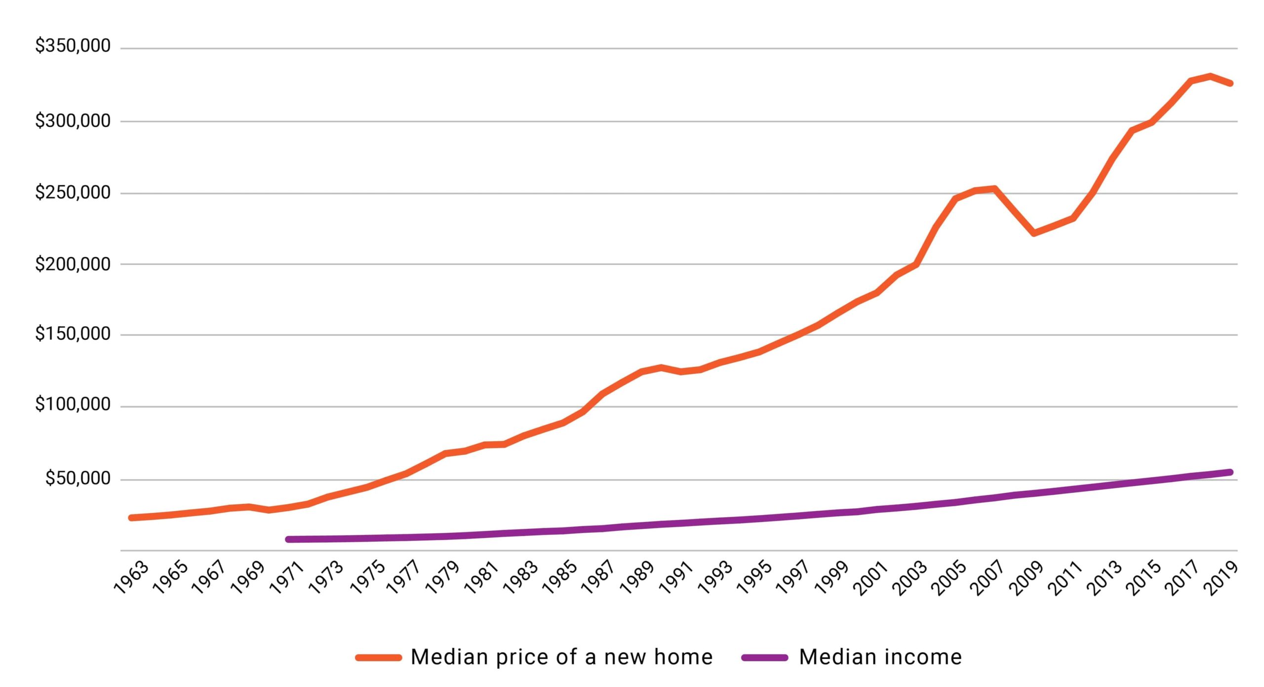
Figure 6 provides the same illustration but compares nominal median income with the nominal cost of tuition, fees, room, and board at a four-year private nonprofit college and a four-year public college.71Source (college pricing): Ma, Jennifer, Matea Pender, and CJ Libassi. 2020. Trends in College Pricing and Student Aid 2020. Table CP-2, Excel Data. New York, College Board.Source (median income): U.S. Census Bureau. 2020. Historical Income Tables: Households. Table H-6. In 1975, median income was $11,800 compared to $3,680 for the cost of a year of private college and $1,780 for a year of public college. In 2019, median income was $68,700 while a year of private college cost $49,870 and a year of public college cost $21,950. Thus, the cost of a year at a public college went from one-sixth of the median family’s income to almost one-third.
Figure 6. Cost of Tuition, Fees, Room, and Board of Four-Year Colleges vs. Pre-Tax Median Household Income in Nominal Dollars, 1971/72–2019/20
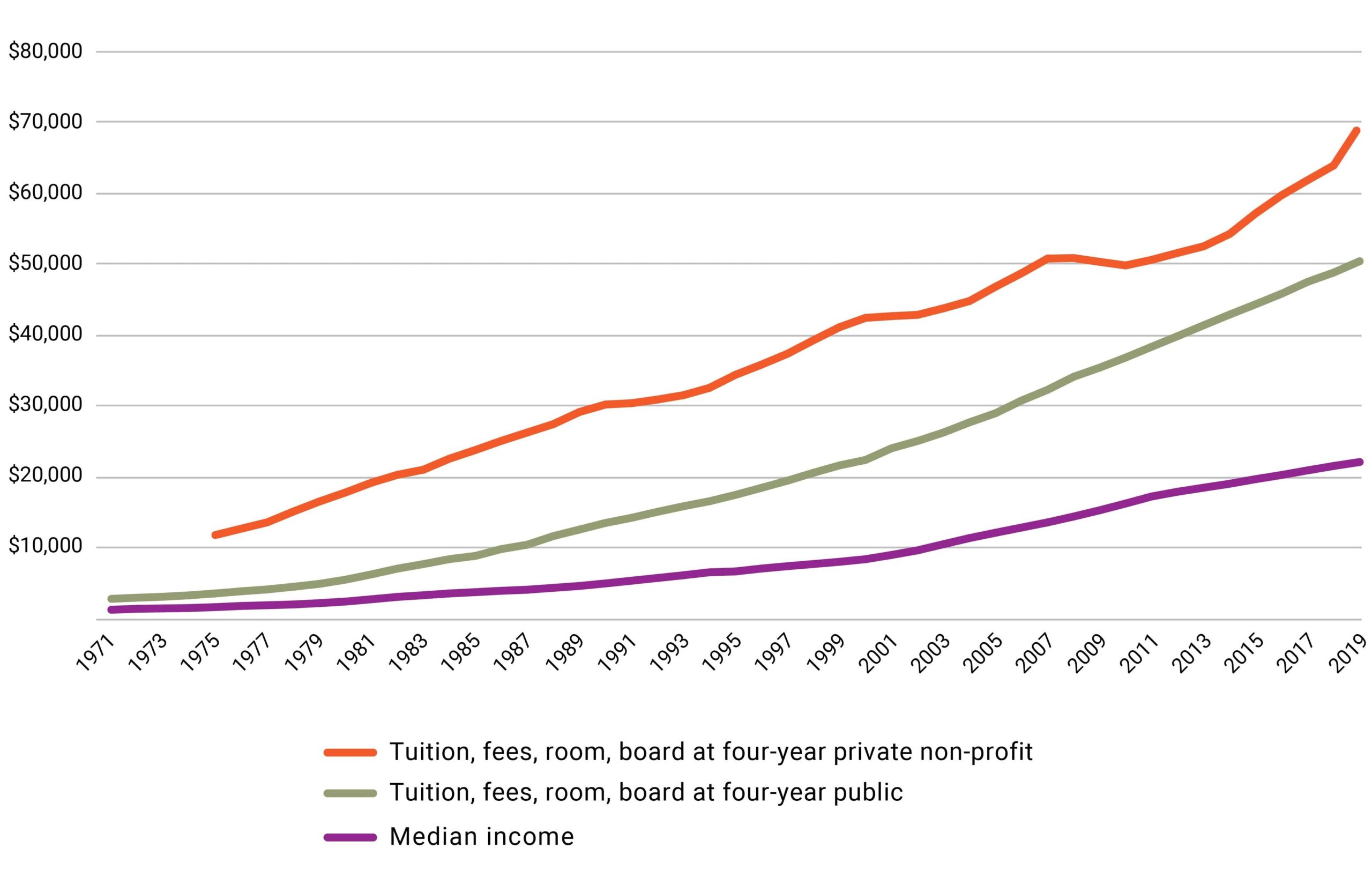
The growth in the price of homes and tuition, both hallmarks of economic security, is greatly outpacing ability to pay. In 1975, if prospective homebuyers at median income saved 10 percent a year, they could afford a 20 percent down payment for a home in six and a half years. In 2019, it would take ten and a half years. Similarly, in 1975, if they used that 10 percent instead for college, they could fully finance a four-year private education in twelve years and a public one in six. In 2019, savings at a rate of 10 percent of median income annually would take thirty-three years to finance a four-year private education fully and fourteen to finance a public one.72These calculations assume that the savings are not invested in growing assets.
Comparing rates of growth in housing prices and tuition rates (see Figures 5 and 6), most households have little hope to afford such items without undertaking enormous debt.
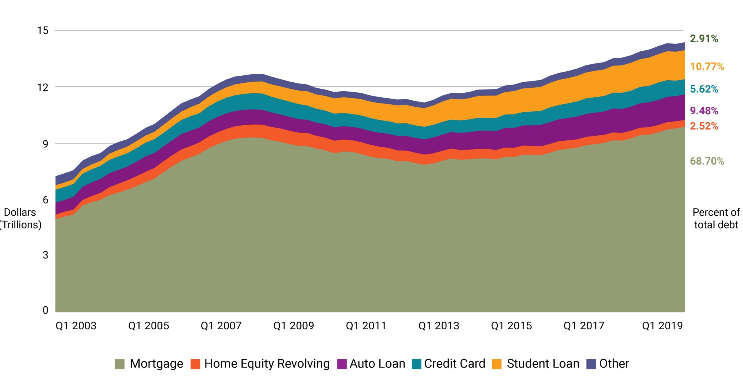
Indeed, there is evidence that household debt is increasing.73Board of Governors of the Federal Reserve System (U.S.), Household Financial Obligations as a Percent of Disposable Personal Income [FODSP], retrieved from FRED, Federal Reserve Bank of St. Louis; https://fred.stlouisfed.org/series/FODSP, November 19, 2020. Figure 7 shows that total household debt has more than doubled since 2003.74Federal Reserve Bank of New York. 2020. Quarterly Report on Household Debt and Credit, 2020: Q3. Total Debt Balance and Its Composition. p.3.“Home equity revolving” accounts are also known as “home equity lines of credit.” They can be thought of as “home equity loans with a revolving line of credit where the borrower can choose when and how often to borrow up to an updated credit limit” p. 42). Over the same period, median income increased by less than 14 percent.75Median income increased by about 13.8 percent nominally between 2003 and 2019. Like home prices and college tuition, household debt is rising much faster than income.
Figure 7. Household Debt by Type of Debt, Trillions of Nominal Dollars, 2003–2020
Debt itself is not a bad thing; financing an investment that will lead to higher income or economic security in the future is considered a sound practice.76See Fichtner 2019 for an analysis of increasing levels of debt among retirees and the extent to which debt is reducing economic security in retirement. Accumulating debt payments, however, may increase economic insecurity.77Monica Prasad 2019 provides evidence that higher levels of spending on social insurance across OECD nations is associated with lower levels of household indebtedness. Allen et al. 2017 provides causal evidence that the 2011–2012 Medicaid expansion in California resulted in lower demand for high-interest loans. To this extent, debt—especially high-interest debt—might be viewed as both a symptom and reinforcer of economic insecurity.
The inverse of debt is savings, and as debt has increased, savings has decreased.
Figure 8. Personal Savings as a Percentage of Disposable Income, 1959–2019
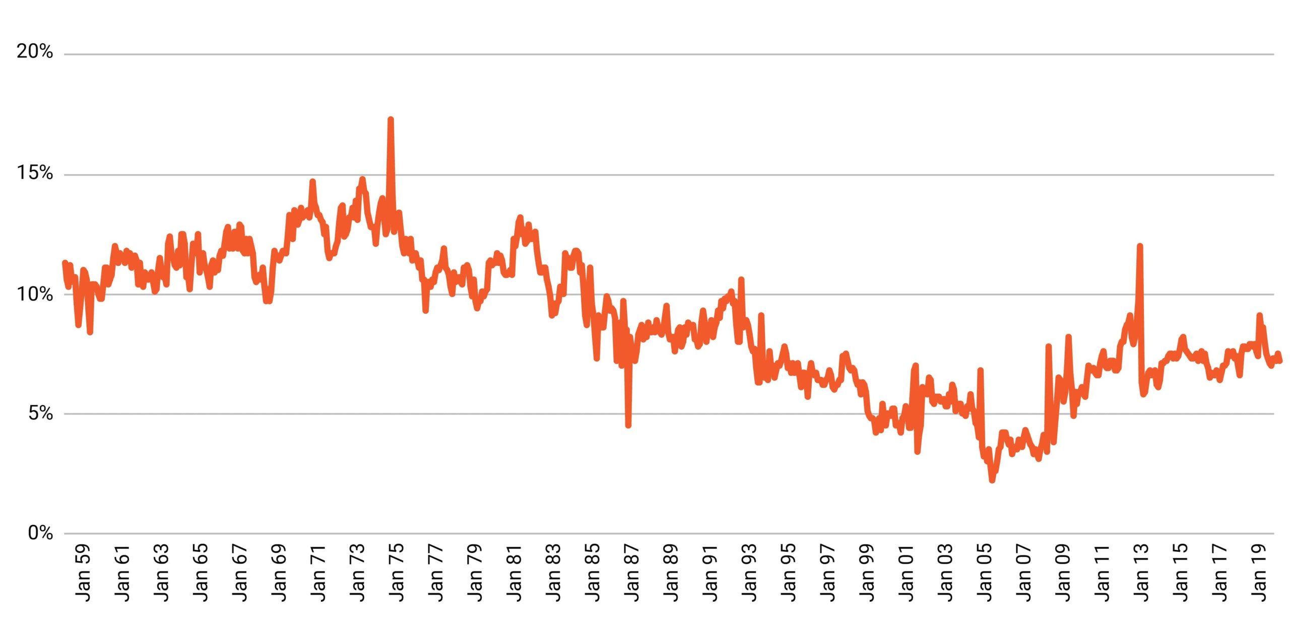
Figure 8 depicts the downward trend in saving rates among individuals in the U.S. over the past sixty years.78Bureau of Economic Analysis. 2021. National Income and Product Accounts. Table 2.6. Personal Income and Its Disposition, Monthly. Between 1959 and 1985—in periods of economic expansion and decline—the average savings rate in a given year rarely fell below 10 percent. Since then, 2020 was the only year in which the average savings rate exceeded 10 percent (individual months may be higher in the figure).79The year 2020 is excluded from Figure 8 because—due to the unprecedented nature of the pandemic—the savings rate data are extraordinarily high and make the prior sixty years more difficult to understand. This period is underscored by historically low savings rates prior to the Great Recession; they reached an annual average as low as 3.1 percent of disposable income in 2005. Altogether, weak income growth has a parallel trend of declining savings. Consequently, many today have minimal savings to draw on.80In August 2020, 34 percent of U.S. adults reported having less than $1,000, and 55 percent reported having $5,000 or less. This survey took place following the four highest monthly savings rates since 1959 from April through July 2021.
An oft-cited study states that about half of U.S. households cannot cover an unexpected $400 expense.81This finding comes from the Survey of Household Economics and Dynamics (SHED) and the Survey of Consumer Finances (SCF), both from the Federal Reserve. Both of these surveys inform the Fed’s annual Report on the Economic Well-Being of U.S. Households. The first year the question was asked (2013), 50 percent of respondents answered in the negative. The portion declined to 37 percent in 2019. The implications of this finding are often exaggerated. The question asks whether the person has cash on hand to cover the expense. A large majority of the half who do not have sufficient cash answered that they would borrow from a friend or family member, sell something, delay other payments, or employ other strategies that would allow payment of the $400 expense. While the finding does not mean that half of the population is $400 away from ruin, it does mean that half have hardly any breathing room in their budgets. Critically, the individuals who answered that they did not have $400 in cash were not all poor. About a third of the respondents had $35,000–$40,000 in income, but also had student loans, installment loans, a mortgage, or a combination of the three.82This explanation is according to the author’s analysis in Why Are So Many Households Unable to Cover a $400 Expense? (Chen 2019).
As we noted, income inequality greatly curtails the gains in average economic status among the population and demonstrates that not all households share in those gains. We showed that inequality by comparing the top half of households to the bottom half. There is also persistent inequality among different racial groups. The median wage or income for Black households and Hispanic households was much less than the wage or income for White households, even when looking within categories of educational attainment (Table 4).83Source (wage data): Economic Policy Institute. 2019. State of Working America Data Library. Wages by education. Original data from the Current Population Survey Outgoing Rotation Group microdata.Source (income data): U.S. Census Bureau. 2020. PINC-03. Educational Attainment: People 25 Years Old and Over, by Total Money Earnings, Work Experience, Age, Race, Hispanic Origin, and Sex. 25 Years and Over, Total Work Experience “White alone, not Hispanic”, “Black alone,” and “Hispanic (any race).” Current Population Survey Annual Social and Economic Supplement.
Table 4. Wage and Income by Race and Education Level, 201984 Income data are presented by the Census Bureau in smaller subgroups than in this table. For example, “>High school” is broken down into “less than 9th grade” and “9th to 12th nongrad.” To account for this, the data presented here are the weighted sums of the median income data presented by the Census Bureau (when necessary).
| Median Wage | Median Income | |||||
| Black | Hispanic | White | Black | Hispanic | White | |
| < High school | $12.40 | $14.60 | $13.88 | $24,303 | $25,832 | $30,779 |
| High school | $16.37 | $17.88 | $20.04 | $30,437 | $32,299 | $38,869 |
| Some college | $17.86 | $19.23 | $22.26 | $36,348 | $36,979 | $44,026 |
| Bachelor’s degree | $27.81 | $30.35 | $35.90 | $49,928 | $48,699 | $61,414 |
| Advanced degree | $37.33 | $40.80 | $45.29 | $69,713 | $65,878 | $81,235 |
A difference in income might reflect benign causes. There is not an identical distribution of Black and White individuals across U.S. states or regions, for example.
85Kaiser Family Foundation. 2020. Population Distribution by Race/Ethnicity. But it certainly reflects more malicious causes as well. There is a large and robust literature documenting discrimination against Black workers in the hiring process.86Are Emily and Greg More Employable than Lakisha and Jamal? is known as the landmark study that quantified some aspects of racial discrimination in the hiring process. Quillian et al. 2017 reviewed more than two dozen similar studies and found that the same result has persisted over the last three decades for Black individuals. This has implications in terms of longer unemployment spells, higher unemployment rates, and lower income.
But the differences do not stop with income. The ability to save, for example, is greatly hindered by not having a bank account. Six percent of the U.S. population is unbanked, meaning that they do not have a checking, savings, or money market account. Virtually all of those unbanked individuals had incomes of less than $40,000 a year. On racial lines, 14 percent of Black individuals were unbanked compared with 10 percent of Hispanic individuals and only 3 percent of White individuals. Those unbanked individuals report instead using alternative financial services that are often associated with high fees or interest rates, such as money orders, check cashing services, payday loans, and pawn shops.87Board of Governors of the Federal Reserve System. 2020. Report on the Economic Well-Being of U.S. Households in 2019–May 2020. Banking and Credit. Figure 18 and Tables 10 and 11.
Similarly, Black and Hispanic individuals also hold more student loan debt than White individuals and are more likely to be behind on payments.88U.S. Department of Education, National Center for Education Statistics. 2016/17 Baccalaureate and Beyond Longitudinal Study (B&B:16/17). Table 5.1. Cumulative Amount Borrowed and Percent Owed. Being behind on student debt is also correlated with being a first-generation college student.89Board of Governors of the Federal Reserve System. 2020. Report on the Economic Well-Being of U.S. Households in 2019– May 2020. Student Loans and Other Education Debt. Figures 33 and 34. A more troubling form of debt held by Black and Hispanic households is unpaid legal expenses, fines, or court costs. This is debt associated with interaction with the criminal justice system. Only 5 percent of White individuals have this type of debt, compared to 12 percent of Black individuals and 9 percent of Hispanic individuals.90Board of Governors of the Federal Reserve System. 2020. Report on the Economic Well-Being of U.S. Households in 2019–May 2020. Overall Well-Being in 2019. Box 2, Table A. Exposure to Crime and the Court System. A report from the U.S. Commission on Civil Rights found that “municipalities target poor citizens and communities of color for fines and fees.”91U.S. Commission on Civil Rights. 2017. Targeted Fines and Fees Against Communities of Color: Civil Rights & Constitutional Implications.
It is important to keep in mind, however, that many surveys of income, wealth, savings, and debt do not ask about identification with certain demographic groups. It is typical for a household survey, like the Current Population Survey (which is used to estimate the unemployment rate) to ask about race, gender, age, and education. It is less common for a survey to ask about sexual orientation or religion.
Research has shown that the LGBTQ community also faces discrimination in the labor market.92Tilcsik 2011 documents variation in response to job applications in which resumes show experience in a gay campus organization. He finds “in some but not all states, significant discrimination against the fictitious applicants who appeared to be gay.” This finding is reinforced by Badgett et al. 2009. While we might expect discrimination to have lessened since these papers were written, there is little question as to whether discrimination against the LGBTQ community still exists in the labor market. The 2015 U.S. Transgender Survey (see page 5) found that 15 percent of respondents were unemployed (compared to 5 percent of the total population at the time), and 29 percent of respondents were living in poverty (12 percent in total U.S. population). Federal law did not explicitly prohibit from firing or discriminating against a worker for their sexual orientation until June 2020.93Human Rights Campaign. 2020. U.S. Supreme Court Is on the Right Side of History for LGBTQ. And many LGBTQ individuals are, or were at some point in time, cut off from their families, including financially. Additionally, cities that are typically welcoming to LGBTQ individuals tend to be relatively high-priced cities.94Chai and Maroto 2019 inspect the various sources of economic insecurity for gay and bisexual men in recent decades. Labor market discrimination, lack of help from family, and a higher likelihood of living in an expensive city are all thought to be contributors to the higher levels of poverty and financial insecurity among LGBTQ households.
Hence, the level of income growth of the past five decades has not been sufficient for many in the U.S. to establish economic security. The growth was weak for the bottom half of households and, indicative of that weak growth, coincided with decreases in savings and increases in debt.
- 51Whereas, before taxes and transfers in 2017, labor income made up 61 percent of total income for the lowest income quintile, 68 percent of income for the middle three quintiles, and 70 percent for those in the 81st to 99th percentiles, labor income accounted for only one-third of income for the top 1 percent of earners. See The Distribution of Household Income, 2017 (Congressional Budget Office) for more information.
- 52Occupational Employment Statistics. 2020. May 2019 National Occupational Employment and Wage Estimates United States. U.S. Bureau of Labor Statistics.
- 53As of March 2020, 88 percent of full time, nonfederal employees have access to paid sick leave. Of this population, 87 percent have access to paid vacations, but only 25 percent have access to paid family leave. Access rates are significantly lower for part-time workers. (U.S. Bureau of Labor Statistics, 2020).
- 54Assistant Secretary for Planning and Evaluation. 2019 Poverty Guidelines. U.S. Department of Health and Human Services.
- 55The median annual earnings for an additional 1.4 million workers are less than $31,200—the earnings of a full-time, full-year worker at $15 per hour. The Occupational Employment and Wage Statistics does not offer median wage data for these occupations (“teaching assistants, except postsecondary”; “legislators”; and “umpires, referees, and other sports officials”).
- 56This total excludes self-employed workers, who are not employees.
- 57Gould, Elise. 2020. State of Working America Wages 2019. Figure C. Economic Policy Institute.
- 58There are one hundred points, or percentiles, in a distribution. The wage distribution is the wages of each worker in the U.S., ranked from least to most; this can be conceptualized as a line of workers arranged from lowest earning to highest earning. If there were one hundred people in a line, wages at the 10th percentile are the earnings of the tenth person in line, and not the wages of that person and the nine people below him. Therefore, the 10th percentile earner is the highest earner among the ten lowest.
- 59Economic Policy Institute. 2019. State of Working America Data Library. Wages by percentile and wage ratios. Original data from the Current Population Survey Outgoing Rotation Group microdata.
- 60Whether there is a causal link between worker productivity and worker pay, and what is causing weak wage growth, are both topics of intense scrutiny among researchers. Summers and Stansbury 2017 find a strong and positive causal relationship between productivity and compensation, arguing that “other orthogonal factors are likely to be responsible for creating the wedge between productivity and pay in the US economy, suppressing typical workers’ incomes even as productivity growth acts to increase them.” Summers and Stansbury 2018 summarize in detail the existing literature around the productivity-compensation gap:
Computerisation and automation have been put forward as causes of rising mean-median income inequality (e.g. Autor et al. 1998, Acemoglu and Restrepo 2017); and automation, falling prices of investment goods, and rapid labour-augmenting technological change have been put forward as causes of the fall in the labour share (e.g. Karabarbounis and Neiman 2014, Acemoglu and Restrepo 2016, Brynjolffson and McAfee 2014, Lawrence 2015).
At the same time, non-purely technological hypotheses for rising mean-median inequality include the race between education and technology (Goldin and Katz 2007), declining unionisation (Freeman et al. 2016), globalisation (Autor et al. 2013), immigration (Borjas 2003), and the ‘superstar effect’ (Rosen 1981, Gabaix et al. 2016). Non-technological hypotheses for the falling labour share include labour market institutions (Levy and Temin 2007, Mishel and Bivens 2015), market structure and monopoly power (Autor et al. 2017, Barkai 2017), capital accumulation (Piketty 2014, Piketty and Zucman 2014), and the productivity slowdown itself (Grossman et al. 2017).
Benmelech et al. 2018 also discuss the extent to which labor market concentration may contribute to wage stagnation. - 61We show the full series, starting with the first available year. Income at key percentiles of the distribution is estimated and published annually by the Census Bureau. Wages are not. They must be estimated from the raw Census data from the Current Population Survey. Survey methodological changes mean that most wage series start, at the earliest, in 1975.
- 62
- 63Leonesio and Del Bene 2011 find that, using data from 1981 to 2004, the earnings trajectory of male workers at the 50th income percentile or below is declining over time. For female workers during this period, earnings trajectories increased at each income percentile, though by substantially larger magnitudes as one moves up the income scale. Kopczuk and Saez 2010 “find that long-term mobility measures among all workers… display significant increases since 1951 either when measured unconditionally or when measured within cohorts. However, those increases mask substantial heterogeneity across gender groups. Long-term mobility among males has been stable over most of the period with a slight decrease in recent decades. The decrease in the gender earnings gap and the resulting substantial increase in upward mobility over a lifetime for women is the driving force behind the increase in long-term mobility among all workers.” Table 1 in Auten, Gee, and Turner 2013 shows that, of taxpayers in the bottom income quintile in 1987, 52 percent remained in the bottom quintile in 2007 and an additional 23 percent had incomes in the second quintile.
- 64In other words, lack of growth at the bottom of the distribution would not be as noteworthy if there was not growth (especially high levels of growth) at upper portions of the distribution.
- 65Saez, Emmanuel. 2020. Striking It Richer: The Evolution of Top Incomes in the United States (Updated with 2018 Estimates). Figure 1.
- 66Capital gains are income from the profit on a sale of an asset. Typically these include stocks, bonds, real estate, or a business. As noted earlier in this section, the wealthiest households in the U.S. tend to have disproportionate income shares as capital gains relative to the rest of the population (see footnote 51).
- 67Income shares, shown in Figure 4, are not the only measure of income equality. There are also income ratios, the Gini coefficient, and others. They each show an increase in income inequality since the mid-1970s.Researchers have compiled an incredible library of resources to graphically depict the extent of inequality. The Economic Policy Instituteand Inequality.org offer interactive charts that help show changes in the distribution of wealth and income over the past decades in the U.S. The World Inequality Database offers similar charts from nearly every country in the world. Some of the more prominent economists who have written on inequality recently include Joseph Stiglitz, Heather Boushey, Thomas Piketty, Alan Krueger, and James Heckman. This Center on Budget and Policy Priorities report discusses how inequality is measured and the various sources of data.
- 68Source (median price of a new home): U.S. Census Bureau. 2020. New Residential Sales. Median and Average Sale Price of Houses Sold.Source (median income in nominal dollars): U.S. Census Bureau. 2020. Historical Income Tables: Households. Table H-6.
- 69In general, in well-functioning economies, incomes should rise faster than prices: This increase in income levels is the source in the improvement of economic status over time among households. Otherwise, people may have more money but be able to afford less of a good, as is the case with homes and college tuitions.
- 702019 was the first year since 1991 outside of the Great Recession in which median new-home sale prices fell, while median household income saw its largest annual increase since 1979. In short, the ratio of median new home sale prices to median household income fell from 5.2 in 2018 to 4.7 in 2019.
- 71Source (college pricing): Ma, Jennifer, Matea Pender, and CJ Libassi. 2020. Trends in College Pricing and Student Aid 2020. Table CP-2, Excel Data. New York, College Board.Source (median income): U.S. Census Bureau. 2020. Historical Income Tables: Households. Table H-6.
- 72These calculations assume that the savings are not invested in growing assets.
- 73Board of Governors of the Federal Reserve System (U.S.), Household Financial Obligations as a Percent of Disposable Personal Income [FODSP], retrieved from FRED, Federal Reserve Bank of St. Louis; https://fred.stlouisfed.org/series/FODSP, November 19, 2020.
- 74Federal Reserve Bank of New York. 2020. Quarterly Report on Household Debt and Credit, 2020: Q3. Total Debt Balance and Its Composition. p.3.“Home equity revolving” accounts are also known as “home equity lines of credit.” They can be thought of as “home equity loans with a revolving line of credit where the borrower can choose when and how often to borrow up to an updated credit limit” p. 42).
- 75Median income increased by about 13.8 percent nominally between 2003 and 2019.
- 76See Fichtner 2019 for an analysis of increasing levels of debt among retirees and the extent to which debt is reducing economic security in retirement.
- 77Monica Prasad 2019 provides evidence that higher levels of spending on social insurance across OECD nations is associated with lower levels of household indebtedness. Allen et al. 2017 provides causal evidence that the 2011–2012 Medicaid expansion in California resulted in lower demand for high-interest loans. To this extent, debt—especially high-interest debt—might be viewed as both a symptom and reinforcer of economic insecurity.
- 78Bureau of Economic Analysis. 2021. National Income and Product Accounts. Table 2.6. Personal Income and Its Disposition, Monthly.
- 79The year 2020 is excluded from Figure 8 because—due to the unprecedented nature of the pandemic—the savings rate data are extraordinarily high and make the prior sixty years more difficult to understand.
- 80In August 2020, 34 percent of U.S. adults reported having less than $1,000, and 55 percent reported having $5,000 or less. This survey took place following the four highest monthly savings rates since 1959 from April through July 2021.
- 81This finding comes from the Survey of Household Economics and Dynamics (SHED) and the Survey of Consumer Finances (SCF), both from the Federal Reserve. Both of these surveys inform the Fed’s annual Report on the Economic Well-Being of U.S. Households. The first year the question was asked (2013), 50 percent of respondents answered in the negative. The portion declined to 37 percent in 2019.
- 82This explanation is according to the author’s analysis in Why Are So Many Households Unable to Cover a $400 Expense? (Chen 2019).
- 83Source (wage data): Economic Policy Institute. 2019. State of Working America Data Library. Wages by education. Original data from the Current Population Survey Outgoing Rotation Group microdata.Source (income data): U.S. Census Bureau. 2020. PINC-03. Educational Attainment: People 25 Years Old and Over, by Total Money Earnings, Work Experience, Age, Race, Hispanic Origin, and Sex. 25 Years and Over, Total Work Experience “White alone, not Hispanic”, “Black alone,” and “Hispanic (any race).” Current Population Survey Annual Social and Economic Supplement.
- 84Income data are presented by the Census Bureau in smaller subgroups than in this table. For example, “>High school” is broken down into “less than 9th grade” and “9th to 12th nongrad.” To account for this, the data presented here are the weighted sums of the median income data presented by the Census Bureau (when necessary).
- 85Kaiser Family Foundation. 2020. Population Distribution by Race/Ethnicity.
- 86Are Emily and Greg More Employable than Lakisha and Jamal? is known as the landmark study that quantified some aspects of racial discrimination in the hiring process. Quillian et al. 2017 reviewed more than two dozen similar studies and found that the same result has persisted over the last three decades for Black individuals.
- 87Board of Governors of the Federal Reserve System. 2020. Report on the Economic Well-Being of U.S. Households in 2019–May 2020. Banking and Credit. Figure 18 and Tables 10 and 11.
- 88U.S. Department of Education, National Center for Education Statistics. 2016/17 Baccalaureate and Beyond Longitudinal Study (B&B:16/17). Table 5.1. Cumulative Amount Borrowed and Percent Owed.
- 89Board of Governors of the Federal Reserve System. 2020. Report on the Economic Well-Being of U.S. Households in 2019– May 2020. Student Loans and Other Education Debt. Figures 33 and 34.
- 90Board of Governors of the Federal Reserve System. 2020. Report on the Economic Well-Being of U.S. Households in 2019–May 2020. Overall Well-Being in 2019. Box 2, Table A. Exposure to Crime and the Court System.
- 91U.S. Commission on Civil Rights. 2017. Targeted Fines and Fees Against Communities of Color: Civil Rights & Constitutional Implications.
- 92Tilcsik 2011 documents variation in response to job applications in which resumes show experience in a gay campus organization. He finds “in some but not all states, significant discrimination against the fictitious applicants who appeared to be gay.” This finding is reinforced by Badgett et al. 2009. While we might expect discrimination to have lessened since these papers were written, there is little question as to whether discrimination against the LGBTQ community still exists in the labor market. The 2015 U.S. Transgender Survey (see page 5) found that 15 percent of respondents were unemployed (compared to 5 percent of the total population at the time), and 29 percent of respondents were living in poverty (12 percent in total U.S. population).
- 93Human Rights Campaign. 2020. U.S. Supreme Court Is on the Right Side of History for LGBTQ.
- 94Chai and Maroto 2019 inspect the various sources of economic insecurity for gay and bisexual men in recent decades.
Income Trends
Income is the annual total amount of money an individual earns in a year before taxes, including money from wages and salaries, self-employment, interest, dividends, rent, and government cash transfers. It does not include nonwage compensation such as the value of health insurance. For all but the top 1 percent of households, the majority of income comes from wages.51Whereas, before taxes and transfers in 2017, labor income made up 61 percent of total income for the lowest income quintile, 68 percent of income for the middle three quintiles, and 70 percent for those in the 81st to 99th percentiles, labor income accounted for only one-third of income for the top 1 percent of earners. See The Distribution of Household Income, 2017 (Congressional Budget Office) for more information.
In the U.S., many jobs are low paid, and many workers earn at or below poverty incomes. Table 3 shows the fifteen largest occupations in the U.S., the number of workers in each occupation, their median hourly wage, and their median annual income.52Occupational Employment Statistics. 2020. May 2019 National Occupational Employment and Wage Estimates United States. U.S. Bureau of Labor Statistics.
Table 3. Employment and Median Hourly Wages in the Largest U.S. Occupations, May 2019
| Occupation | Employment | Median Hourly Wage | Median Annual Income |
| Retail salespersons | 4,317,950 | 12.14 | 25,250 |
| Fast food and counter workers | 3,996,820 | 10.93 | 22,740 |
| Cashiers | 3,596,630 | 11.37 | 23,650 |
| Home health and personal care aides | 3,161,500 | 12.15 | 25,280 |
| Registered nurses | 2,982,280 | 35.24 | 73,300 |
| Office clerks, general | 2,956,060 | 16.37 | 34,040 |
| Laborers and freight, stock, and material movers, hand |
2,953,170 | 14.19 | 29,510 |
| Customer service representatives | 2,919,230 | 16.69 | 34,710 |
| Waiters and waitresses | 2,579,020 | 11.00 | 22,890 |
| General and operations managers | 2,400,280 | 48.45 | 100,780 |
| Janitors and cleaners, except maids and housekeeping cleaners |
2,145,450 | 13.19 | 27,430 |
| Stockers and order fillers | 2,135,850 | 13.16 | 27,380 |
| Secretaries and administrative assistants, except legal, medical, exec. |
2,038,340 | 18.12 | 37,690 |
| Heavy and tractor-trailer truck drivers | 1,856,130 | 21.76 | 45,260 |
| Bookkeeping, accounting, and auditing clerks | 1,512,660 | 19.82 | 41,230 |
Many of these very large occupations (shaded) pay less than $15 per hour at the median, which for a full-time (forty hours per week), full-year (fifty-two weeks per year) worker is $31,200. Given that many full-time workers do not have paid vacation or sick leave, $31,200 is a maximum; it is only feasible if the worker does not miss a single hour of work in the year. For that reason, that maximum is often well above what most of these workers take home, as shown in the final column.53As of March 2020, 88 percent of full time, nonfederal employees have access to paid sick leave. Of this population, 87 percent have access to paid vacations, but only 25 percent have access to paid family leave. Access rates are significantly lower for part-time workers. (U.S. Bureau of Labor Statistics, 2020). For reference, the official federal poverty threshold for a family of four in 2019 was $25,750.54Assistant Secretary for Planning and Evaluation. 2019 Poverty Guidelines. U.S. Department of Health and Human Services. In total, at least 46.5 million workers are in occupations that pay below $15 per hour at the median.55The median annual earnings for an additional 1.4 million workers are less than $31,200—the earnings of a full-time, full-year worker at $15 per hour. The Occupational Employment and Wage Statistics does not offer median wage data for these occupations (“teaching assistants, except postsecondary”; “legislators”; and “umpires, referees, and other sports officials”). This number represents almost a third of all employees in the U.S.56This total excludes self-employed workers, who are not employees.
The large number of workers in jobs with low expected wages is the result of years of weak, or negative, wage growth. Figure 257Gould, Elise. 2020. State of Working America Wages 2019. Figure C. Economic Policy Institute. shows the change in real (adjusted for inflation) wages at different points of the wage distribution.58There are one hundred points, or percentiles, in a distribution. The wage distribution is the wages of each worker in the U.S., ranked from least to most; this can be conceptualized as a line of workers arranged from lowest earning to highest earning. If there were one hundred people in a line, wages at the 10th percentile are the earnings of the tenth person in line, and not the wages of that person and the nine people below him. Therefore, the 10th percentile earner is the highest earner among the ten lowest.
Figure 2. Cumulative Change in Real Hourly Wages of Workers, by Wage Percentile, 1979-2019
Notes: Shaded areas denote recessions. the xth-percentile wage is the wage at which x% of wage earners earn less and (100-x)% earn more.
Source: Elise Gould’s analysis of EPI Current Population Survey Extracts, Version 1.0 (2020), https://microdata.epi.org
At the bottom, workers at the 10th percentile did not see a real wage increase for the thirty-seven-year period from 1979 to 2016. Finally, in 2017—after eight years of GDP growth following the Great Recession—the 10th percentile experienced an increase in real wages relative to 1979 of about 3 percent. Over a forty-year period, this group observed a raise of 32 cents—from $9.75 to $10.07.59Economic Policy Institute. 2019. State of Working America Data Library. Wages by percentile and wage ratios. Original data from the Current Population Survey Outgoing Rotation Group microdata. Workers at the median wage experienced higher, but still relatively anemic, growth in wages after 1996, reaching $19.33 in 2019. Researchers point out that weak growth in wages has occurred despite overall increases in labor productivity, but there is debate as to why that is the case.60Whether there is a causal link between worker productivity and worker pay, and what is causing weak wage growth, are both topics of intense scrutiny among researchers. Summers and Stansbury 2017 find a strong and positive causal relationship between productivity and compensation, arguing that “other orthogonal factors are likely to be responsible for creating the wedge between productivity and pay in the US economy, suppressing typical workers’ incomes even as productivity growth acts to increase them.” Summers and Stansbury 2018 summarize in detail the existing literature around the productivity-compensation gap:
Computerisation and automation have been put forward as causes of rising mean-median income inequality (e.g. Autor et al. 1998, Acemoglu and Restrepo 2017); and automation, falling prices of investment goods, and rapid labour-augmenting technological change have been put forward as causes of the fall in the labour share (e.g. Karabarbounis and Neiman 2014, Acemoglu and Restrepo 2016, Brynjolffson and McAfee 2014, Lawrence 2015).
At the same time, non-purely technological hypotheses for rising mean-median inequality include the race between education and technology (Goldin and Katz 2007), declining unionisation (Freeman et al. 2016), globalisation (Autor et al. 2013), immigration (Borjas 2003), and the ‘superstar effect’ (Rosen 1981, Gabaix et al. 2016). Non-technological hypotheses for the falling labour share include labour market institutions (Levy and Temin 2007, Mishel and Bivens 2015), market structure and monopoly power (Autor et al. 2017, Barkai 2017), capital accumulation (Piketty 2014, Piketty and Zucman 2014), and the productivity slowdown itself (Grossman et al. 2017).
Benmelech et al. 2018 also discuss the extent to which labor market concentration may contribute to wage stagnation.
This stall in wage growth is similarly reflected in income growth. Figure 3 shows real (adjusted for inflation) pre-tax income growth from 1968 to 201961We show the full series, starting with the first available year. Income at key percentiles of the distribution is estimated and published annually by the Census Bureau. Wages are not. They must be estimated from the raw Census data from the Current Population Survey. Survey methodological changes mean that most wage series start, at the earliest, in 1975. from households at key points of the distribution.62DQYDJ. 2020. Household Income by Year: Average, Median, One Percent (and a Percentile Calculator). “Income” in Figures 3 through 6 refers to all pre-tax cash income, including sources of unearned income; it excludes the value of noncash transfers such as benefits from SNAP and post-tax cash transfers such as benefits from the EITC.
Figure 3. Pre-Tax Household Income by Percentiles and Average Income in 2020 Dollars, 1968–2019
At the bottom, the 10th percentile household real income in 1968 was $12,444, and it grew to $14,874 in 2019, an increase of about $2,500 over fifty years (a 19.5 percent increase). The 25th percentile had a similarly small gain of $3,300 (an 11.7 percent increase), and incomes at the median had a gain of about $10,400 (a 19.4 percent increase). Both Figures 2 and 3 depict income growth at the bottom and median as slow or even negligible in recent history.
These figures are not comparing a single person over time, but rather, people of the same relative wage or same relative income at different points in time. Slow growth at the bottom of the wage or income distribution would be less problematic if most workers did not stay at that wage or income for long. For instance, most people earn their lowest wage in their first job because they are young and do not have any experience and earn more as they accrue more experience. A person may start at the 35th percentile but retire at the 85th. Studies of lifetime earnings, however, are pessimistic. Even when looking at the total a person earns over their career, the growth in income and wages of workers in the bottom half of the distribution is small, especially in comparison to the top end of the distribution.63Leonesio and Del Bene 2011 find that, using data from 1981 to 2004, the earnings trajectory of male workers at the 50th income percentile or below is declining over time. For female workers during this period, earnings trajectories increased at each income percentile, though by substantially larger magnitudes as one moves up the income scale. Kopczuk and Saez 2010 “find that long-term mobility measures among all workers… display significant increases since 1951 either when measured unconditionally or when measured within cohorts. However, those increases mask substantial heterogeneity across gender groups. Long-term mobility among males has been stable over most of the period with a slight decrease in recent decades. The decrease in the gender earnings gap and the resulting substantial increase in upward mobility over a lifetime for women is the driving force behind the increase in long-term mobility among all workers.” Table 1 in Auten, Gee, and Turner 2013 shows that, of taxpayers in the bottom income quintile in 1987, 52 percent remained in the bottom quintile in 2007 and an additional 23 percent had incomes in the second quintile.
Slow growth at the bottom of the wage or income distribution would also be less problematic if income at the top of the distribution only grew apace.64In other words, lack of growth at the bottom of the distribution would not be as noteworthy if there was not growth (especially high levels of growth) at upper portions of the distribution. Instead, growth at the top was much faster than growth at the bottom. At the 90th percentile (or the bottom end of the highest earning 10 percent), wages grew by 44.3 percent between 1979 and 2019 compared to 3.3 percent for the 10th percentile. Over the same period income, at the 90th percentile increased by $54,000, or 40.7 percent, compared to a 0.4 percent decline at the 10th percentile (see figure 3).
Income inequality is not a constant in the U.S. economy, and evidence suggests that it has worsened over the past forty years. Figure 4 shows the income shares of the top 10 percent of households since 1917, or how much of all income in the U.S. was taken home by the top 10 percent of households in the income distribution.65Saez, Emmanuel. 2020. Striking It Richer: The Evolution of Top Incomes in the United States (Updated with 2018 Estimates). Figure 1.
Figure 4. Share of Total Income Taken Home by Top 10 Percent of Households Prior to Taxes and Transfers, 1917–2018 66Capital gains are income from the profit on a sale of an asset. Typically these include stocks, bonds, real estate, or a business. As noted earlier in this section, the wealthiest households in the U.S. tend to have disproportionate income shares as capital gains relative to the rest of the population (see footnote 51).
The ten years preceding the Great Depression saw growing income concentration. During the Depression, the top 10 percent income share held steady at 45 percent and then fell beginning in 1940. For the next four decades, the top ten percent of the distribution took home a third of all income. Starting in the late 1970s, the share going to the bottom 90 percent steadily eroded until, in 2012, more than half of all income went to the top ten percent of households. Put another way, the total income of the bottom 90 percent was less than the total income of the top 10 percent. Not only does this show the increase in income accruing to the highest earners but also that this trend is recent and not a permanent or necessary feature of the U.S. economy.67Income shares, shown in Figure 4, are not the only measure of income equality. There are also income ratios, the Gini coefficient, and others. They each show an increase in income inequality since the mid-1970s.Researchers have compiled an incredible library of resources to graphically depict the extent of inequality. The Economic Policy Instituteand Inequality.org offer interactive charts that help show changes in the distribution of wealth and income over the past decades in the U.S. The World Inequality Database offers similar charts from nearly every country in the world. Some of the more prominent economists who have written on inequality recently include Joseph Stiglitz, Heather Boushey, Thomas Piketty, Alan Krueger, and James Heckman. This Center on Budget and Policy Priorities report discusses how inequality is measured and the various sources of data.
It is not clear what the relationship is between economic inequality and economic insecurity. Slow income growth for the bottom half of households does not necessarily mean that they are all economically insecure. And importantly, inequality is a result, not a cause. It is a summary of the income distribution. At the very least, income inequality greatly curtails the gains in average economic status among the population and demonstrates that not all households share in those gains.
To explore that disparity, we examine two traditional channels of attaining economic security: buying a home and going to college, the former being an asset that provides security and the latter a means of attaining higher income. Figure 5 shows the growth in the median sale price of a new home and median income in nominal dollars—that is, the actual dollar amount not adjusted for the average change in prices over time.68Source (median price of a new home): U.S. Census Bureau. 2020. New Residential Sales. Median and Average Sale Price of Houses Sold.Source (median income in nominal dollars): U.S. Census Bureau. 2020. Historical Income Tables: Households. Table H-6. The dollars are not adjusted because Figures 5 and 6 examine two goods (home and, separately, tuition) have increased in cost much faster than average prices and, as the figures show, much faster than income.69In general, in well-functioning economies, incomes should rise faster than prices: This increase in income levels is the source in the improvement of economic status over time among households. Otherwise, people may have more money but be able to afford less of a good, as is the case with homes and college tuitions.
In 1975, nominal median (the 50th percentile) household income in the U.S. was $11,800 and the nominal median sale price of a new home was $39,300. By 2019, median household income in the U.S. was $68,700 and the median sale price of a new home was $321,500. The price of a home jumped from about three times annual income to nearly five times annual income.702019 was the first year since 1991 outside of the Great Recession in which median new-home sale prices fell, while median household income saw its largest annual increase since 1979. In short, the ratio of median new home sale prices to median household income fell from 5.2 in 2018 to 4.7 in 2019.
Figure 5. Median Sale Price of a New Home vs. Pre-Tax Median Household Income in Nominal Dollars, 1963–2019
Figure 6 provides the same illustration but compares nominal median income with the nominal cost of tuition, fees, room, and board at a four-year private nonprofit college and a four-year public college.71Source (college pricing): Ma, Jennifer, Matea Pender, and CJ Libassi. 2020. Trends in College Pricing and Student Aid 2020. Table CP-2, Excel Data. New York, College Board.Source (median income): U.S. Census Bureau. 2020. Historical Income Tables: Households. Table H-6. In 1975, median income was $11,800 compared to $3,680 for the cost of a year of private college and $1,780 for a year of public college. In 2019, median income was $68,700 while a year of private college cost $49,870 and a year of public college cost $21,950. Thus, the cost of a year at a public college went from one-sixth of the median family’s income to almost one-third.
Figure 6. Cost of Tuition, Fees, Room, and Board of Four-Year Colleges vs. Pre-Tax Median Household Income in Nominal Dollars, 1971/72–2019/20
The growth in the price of homes and tuition, both hallmarks of economic security, is greatly outpacing ability to pay. In 1975, if prospective homebuyers at median income saved 10 percent a year, they could afford a 20 percent down payment for a home in six and a half years. In 2019, it would take ten and a half years. Similarly, in 1975, if they used that 10 percent instead for college, they could fully finance a four-year private education in twelve years and a public one in six. In 2019, savings at a rate of 10 percent of median income annually would take thirty-three years to finance a four-year private education fully and fourteen to finance a public one.72These calculations assume that the savings are not invested in growing assets.
Comparing rates of growth in housing prices and tuition rates (see Figures 5 and 6), most households have little hope to afford such items without undertaking enormous debt.
Indeed, there is evidence that household debt is increasing.73Board of Governors of the Federal Reserve System (U.S.), Household Financial Obligations as a Percent of Disposable Personal Income [FODSP], retrieved from FRED, Federal Reserve Bank of St. Louis; https://fred.stlouisfed.org/series/FODSP, November 19, 2020. Figure 7 shows that total household debt has more than doubled since 2003.74Federal Reserve Bank of New York. 2020. Quarterly Report on Household Debt and Credit, 2020: Q3. Total Debt Balance and Its Composition. p.3.“Home equity revolving” accounts are also known as “home equity lines of credit.” They can be thought of as “home equity loans with a revolving line of credit where the borrower can choose when and how often to borrow up to an updated credit limit” p. 42). Over the same period, median income increased by less than 14 percent.75Median income increased by about 13.8 percent nominally between 2003 and 2019. Like home prices and college tuition, household debt is rising much faster than income.
Figure 7. Household Debt by Type of Debt, Trillions of Nominal Dollars, 2003–2020
Debt itself is not a bad thing; financing an investment that will lead to higher income or economic security in the future is considered a sound practice.76See Fichtner 2019 for an analysis of increasing levels of debt among retirees and the extent to which debt is reducing economic security in retirement. Accumulating debt payments, however, may increase economic insecurity.77Monica Prasad 2019 provides evidence that higher levels of spending on social insurance across OECD nations is associated with lower levels of household indebtedness. Allen et al. 2017 provides causal evidence that the 2011–2012 Medicaid expansion in California resulted in lower demand for high-interest loans. To this extent, debt—especially high-interest debt—might be viewed as both a symptom and reinforcer of economic insecurity.
The inverse of debt is savings, and as debt has increased, savings has decreased.
Figure 8. Personal Savings as a Percentage of Disposable Income, 1959–2019
Figure 8 depicts the downward trend in saving rates among individuals in the U.S. over the past sixty years.78Bureau of Economic Analysis. 2021. National Income and Product Accounts. Table 2.6. Personal Income and Its Disposition, Monthly. Between 1959 and 1985—in periods of economic expansion and decline—the average savings rate in a given year rarely fell below 10 percent. Since then, 2020 was the only year in which the average savings rate exceeded 10 percent (individual months may be higher in the figure).79The year 2020 is excluded from Figure 8 because—due to the unprecedented nature of the pandemic—the savings rate data are extraordinarily high and make the prior sixty years more difficult to understand. This period is underscored by historically low savings rates prior to the Great Recession; they reached an annual average as low as 3.1 percent of disposable income in 2005. Altogether, weak income growth has a parallel trend of declining savings. Consequently, many today have minimal savings to draw on.80In August 2020, 34 percent of U.S. adults reported having less than $1,000, and 55 percent reported having $5,000 or less. This survey took place following the four highest monthly savings rates since 1959 from April through July 2021.
An oft-cited study states that about half of U.S. households cannot cover an unexpected $400 expense.81This finding comes from the Survey of Household Economics and Dynamics (SHED) and the Survey of Consumer Finances (SCF), both from the Federal Reserve. Both of these surveys inform the Fed’s annual Report on the Economic Well-Being of U.S. Households. The first year the question was asked (2013), 50 percent of respondents answered in the negative. The portion declined to 37 percent in 2019. The implications of this finding are often exaggerated. The question asks whether the person has cash on hand to cover the expense. A large majority of the half who do not have sufficient cash answered that they would borrow from a friend or family member, sell something, delay other payments, or employ other strategies that would allow payment of the $400 expense. While the finding does not mean that half of the population is $400 away from ruin, it does mean that half have hardly any breathing room in their budgets. Critically, the individuals who answered that they did not have $400 in cash were not all poor. About a third of the respondents had $35,000–$40,000 in income, but also had student loans, installment loans, a mortgage, or a combination of the three.82This explanation is according to the author’s analysis in Why Are So Many Households Unable to Cover a $400 Expense? (Chen 2019).
As we noted, income inequality greatly curtails the gains in average economic status among the population and demonstrates that not all households share in those gains. We showed that inequality by comparing the top half of households to the bottom half. There is also persistent inequality among different racial groups. The median wage or income for Black households and Hispanic households was much less than the wage or income for White households, even when looking within categories of educational attainment (Table 4).83Source (wage data): Economic Policy Institute. 2019. State of Working America Data Library. Wages by education. Original data from the Current Population Survey Outgoing Rotation Group microdata.Source (income data): U.S. Census Bureau. 2020. PINC-03. Educational Attainment: People 25 Years Old and Over, by Total Money Earnings, Work Experience, Age, Race, Hispanic Origin, and Sex. 25 Years and Over, Total Work Experience “White alone, not Hispanic”, “Black alone,” and “Hispanic (any race).” Current Population Survey Annual Social and Economic Supplement.
Table 4. Wage and Income by Race and Education Level, 201984 Income data are presented by the Census Bureau in smaller subgroups than in this table. For example, “>High school” is broken down into “less than 9th grade” and “9th to 12th nongrad.” To account for this, the data presented here are the weighted sums of the median income data presented by the Census Bureau (when necessary).
| Median Wage | Median Income | |||||
| Black | Hispanic | White | Black | Hispanic | White | |
| < High school | $12.40 | $14.60 | $13.88 | $24,303 | $25,832 | $30,779 |
| High school | $16.37 | $17.88 | $20.04 | $30,437 | $32,299 | $38,869 |
| Some college | $17.86 | $19.23 | $22.26 | $36,348 | $36,979 | $44,026 |
| Bachelor’s degree | $27.81 | $30.35 | $35.90 | $49,928 | $48,699 | $61,414 |
| Advanced degree | $37.33 | $40.80 | $45.29 | $69,713 | $65,878 | $81,235 |
A difference in income might reflect benign causes. There is not an identical distribution of Black and White individuals across U.S. states or regions, for example.
85Kaiser Family Foundation. 2020. Population Distribution by Race/Ethnicity. But it certainly reflects more malicious causes as well. There is a large and robust literature documenting discrimination against Black workers in the hiring process.86Are Emily and Greg More Employable than Lakisha and Jamal? is known as the landmark study that quantified some aspects of racial discrimination in the hiring process. Quillian et al. 2017 reviewed more than two dozen similar studies and found that the same result has persisted over the last three decades for Black individuals. This has implications in terms of longer unemployment spells, higher unemployment rates, and lower income.
But the differences do not stop with income. The ability to save, for example, is greatly hindered by not having a bank account. Six percent of the U.S. population is unbanked, meaning that they do not have a checking, savings, or money market account. Virtually all of those unbanked individuals had incomes of less than $40,000 a year. On racial lines, 14 percent of Black individuals were unbanked compared with 10 percent of Hispanic individuals and only 3 percent of White individuals. Those unbanked individuals report instead using alternative financial services that are often associated with high fees or interest rates, such as money orders, check cashing services, payday loans, and pawn shops.87Board of Governors of the Federal Reserve System. 2020. Report on the Economic Well-Being of U.S. Households in 2019–May 2020. Banking and Credit. Figure 18 and Tables 10 and 11.
Similarly, Black and Hispanic individuals also hold more student loan debt than White individuals and are more likely to be behind on payments.88U.S. Department of Education, National Center for Education Statistics. 2016/17 Baccalaureate and Beyond Longitudinal Study (B&B:16/17). Table 5.1. Cumulative Amount Borrowed and Percent Owed. Being behind on student debt is also correlated with being a first-generation college student.89Board of Governors of the Federal Reserve System. 2020. Report on the Economic Well-Being of U.S. Households in 2019– May 2020. Student Loans and Other Education Debt. Figures 33 and 34. A more troubling form of debt held by Black and Hispanic households is unpaid legal expenses, fines, or court costs. This is debt associated with interaction with the criminal justice system. Only 5 percent of White individuals have this type of debt, compared to 12 percent of Black individuals and 9 percent of Hispanic individuals.90Board of Governors of the Federal Reserve System. 2020. Report on the Economic Well-Being of U.S. Households in 2019–May 2020. Overall Well-Being in 2019. Box 2, Table A. Exposure to Crime and the Court System. A report from the U.S. Commission on Civil Rights found that “municipalities target poor citizens and communities of color for fines and fees.”91U.S. Commission on Civil Rights. 2017. Targeted Fines and Fees Against Communities of Color: Civil Rights & Constitutional Implications.
It is important to keep in mind, however, that many surveys of income, wealth, savings, and debt do not ask about identification with certain demographic groups. It is typical for a household survey, like the Current Population Survey (which is used to estimate the unemployment rate) to ask about race, gender, age, and education. It is less common for a survey to ask about sexual orientation or religion.
Research has shown that the LGBTQ community also faces discrimination in the labor market.92Tilcsik 2011 documents variation in response to job applications in which resumes show experience in a gay campus organization. He finds “in some but not all states, significant discrimination against the fictitious applicants who appeared to be gay.” This finding is reinforced by Badgett et al. 2009. While we might expect discrimination to have lessened since these papers were written, there is little question as to whether discrimination against the LGBTQ community still exists in the labor market. The 2015 U.S. Transgender Survey (see page 5) found that 15 percent of respondents were unemployed (compared to 5 percent of the total population at the time), and 29 percent of respondents were living in poverty (12 percent in total U.S. population). Federal law did not explicitly prohibit from firing or discriminating against a worker for their sexual orientation until June 2020.93Human Rights Campaign. 2020. U.S. Supreme Court Is on the Right Side of History for LGBTQ. And many LGBTQ individuals are, or were at some point in time, cut off from their families, including financially. Additionally, cities that are typically welcoming to LGBTQ individuals tend to be relatively high-priced cities.94Chai and Maroto 2019 inspect the various sources of economic insecurity for gay and bisexual men in recent decades. Labor market discrimination, lack of help from family, and a higher likelihood of living in an expensive city are all thought to be contributors to the higher levels of poverty and financial insecurity among LGBTQ households.
Hence, the level of income growth of the past five decades has not been sufficient for many in the U.S. to establish economic security. The growth was weak for the bottom half of households and, indicative of that weak growth, coincided with decreases in savings and increases in debt.
- 51Whereas, before taxes and transfers in 2017, labor income made up 61 percent of total income for the lowest income quintile, 68 percent of income for the middle three quintiles, and 70 percent for those in the 81st to 99th percentiles, labor income accounted for only one-third of income for the top 1 percent of earners. See The Distribution of Household Income, 2017 (Congressional Budget Office) for more information.
- 52Occupational Employment Statistics. 2020. May 2019 National Occupational Employment and Wage Estimates United States. U.S. Bureau of Labor Statistics.
- 53As of March 2020, 88 percent of full time, nonfederal employees have access to paid sick leave. Of this population, 87 percent have access to paid vacations, but only 25 percent have access to paid family leave. Access rates are significantly lower for part-time workers. (U.S. Bureau of Labor Statistics, 2020).
- 54Assistant Secretary for Planning and Evaluation. 2019 Poverty Guidelines. U.S. Department of Health and Human Services.
- 55The median annual earnings for an additional 1.4 million workers are less than $31,200—the earnings of a full-time, full-year worker at $15 per hour. The Occupational Employment and Wage Statistics does not offer median wage data for these occupations (“teaching assistants, except postsecondary”; “legislators”; and “umpires, referees, and other sports officials”).
- 56This total excludes self-employed workers, who are not employees.
- 57Gould, Elise. 2020. State of Working America Wages 2019. Figure C. Economic Policy Institute.
- 58There are one hundred points, or percentiles, in a distribution. The wage distribution is the wages of each worker in the U.S., ranked from least to most; this can be conceptualized as a line of workers arranged from lowest earning to highest earning. If there were one hundred people in a line, wages at the 10th percentile are the earnings of the tenth person in line, and not the wages of that person and the nine people below him. Therefore, the 10th percentile earner is the highest earner among the ten lowest.
- 59Economic Policy Institute. 2019. State of Working America Data Library. Wages by percentile and wage ratios. Original data from the Current Population Survey Outgoing Rotation Group microdata.
- 60Whether there is a causal link between worker productivity and worker pay, and what is causing weak wage growth, are both topics of intense scrutiny among researchers. Summers and Stansbury 2017 find a strong and positive causal relationship between productivity and compensation, arguing that “other orthogonal factors are likely to be responsible for creating the wedge between productivity and pay in the US economy, suppressing typical workers’ incomes even as productivity growth acts to increase them.” Summers and Stansbury 2018 summarize in detail the existing literature around the productivity-compensation gap:
Computerisation and automation have been put forward as causes of rising mean-median income inequality (e.g. Autor et al. 1998, Acemoglu and Restrepo 2017); and automation, falling prices of investment goods, and rapid labour-augmenting technological change have been put forward as causes of the fall in the labour share (e.g. Karabarbounis and Neiman 2014, Acemoglu and Restrepo 2016, Brynjolffson and McAfee 2014, Lawrence 2015).
At the same time, non-purely technological hypotheses for rising mean-median inequality include the race between education and technology (Goldin and Katz 2007), declining unionisation (Freeman et al. 2016), globalisation (Autor et al. 2013), immigration (Borjas 2003), and the ‘superstar effect’ (Rosen 1981, Gabaix et al. 2016). Non-technological hypotheses for the falling labour share include labour market institutions (Levy and Temin 2007, Mishel and Bivens 2015), market structure and monopoly power (Autor et al. 2017, Barkai 2017), capital accumulation (Piketty 2014, Piketty and Zucman 2014), and the productivity slowdown itself (Grossman et al. 2017).
Benmelech et al. 2018 also discuss the extent to which labor market concentration may contribute to wage stagnation. - 61We show the full series, starting with the first available year. Income at key percentiles of the distribution is estimated and published annually by the Census Bureau. Wages are not. They must be estimated from the raw Census data from the Current Population Survey. Survey methodological changes mean that most wage series start, at the earliest, in 1975.
- 62
- 63Leonesio and Del Bene 2011 find that, using data from 1981 to 2004, the earnings trajectory of male workers at the 50th income percentile or below is declining over time. For female workers during this period, earnings trajectories increased at each income percentile, though by substantially larger magnitudes as one moves up the income scale. Kopczuk and Saez 2010 “find that long-term mobility measures among all workers… display significant increases since 1951 either when measured unconditionally or when measured within cohorts. However, those increases mask substantial heterogeneity across gender groups. Long-term mobility among males has been stable over most of the period with a slight decrease in recent decades. The decrease in the gender earnings gap and the resulting substantial increase in upward mobility over a lifetime for women is the driving force behind the increase in long-term mobility among all workers.” Table 1 in Auten, Gee, and Turner 2013 shows that, of taxpayers in the bottom income quintile in 1987, 52 percent remained in the bottom quintile in 2007 and an additional 23 percent had incomes in the second quintile.
- 64In other words, lack of growth at the bottom of the distribution would not be as noteworthy if there was not growth (especially high levels of growth) at upper portions of the distribution.
- 65Saez, Emmanuel. 2020. Striking It Richer: The Evolution of Top Incomes in the United States (Updated with 2018 Estimates). Figure 1.
- 66Capital gains are income from the profit on a sale of an asset. Typically these include stocks, bonds, real estate, or a business. As noted earlier in this section, the wealthiest households in the U.S. tend to have disproportionate income shares as capital gains relative to the rest of the population (see footnote 51).
- 67Income shares, shown in Figure 4, are not the only measure of income equality. There are also income ratios, the Gini coefficient, and others. They each show an increase in income inequality since the mid-1970s.Researchers have compiled an incredible library of resources to graphically depict the extent of inequality. The Economic Policy Instituteand Inequality.org offer interactive charts that help show changes in the distribution of wealth and income over the past decades in the U.S. The World Inequality Database offers similar charts from nearly every country in the world. Some of the more prominent economists who have written on inequality recently include Joseph Stiglitz, Heather Boushey, Thomas Piketty, Alan Krueger, and James Heckman. This Center on Budget and Policy Priorities report discusses how inequality is measured and the various sources of data.
- 68Source (median price of a new home): U.S. Census Bureau. 2020. New Residential Sales. Median and Average Sale Price of Houses Sold.Source (median income in nominal dollars): U.S. Census Bureau. 2020. Historical Income Tables: Households. Table H-6.
- 69In general, in well-functioning economies, incomes should rise faster than prices: This increase in income levels is the source in the improvement of economic status over time among households. Otherwise, people may have more money but be able to afford less of a good, as is the case with homes and college tuitions.
- 702019 was the first year since 1991 outside of the Great Recession in which median new-home sale prices fell, while median household income saw its largest annual increase since 1979. In short, the ratio of median new home sale prices to median household income fell from 5.2 in 2018 to 4.7 in 2019.
- 71Source (college pricing): Ma, Jennifer, Matea Pender, and CJ Libassi. 2020. Trends in College Pricing and Student Aid 2020. Table CP-2, Excel Data. New York, College Board.Source (median income): U.S. Census Bureau. 2020. Historical Income Tables: Households. Table H-6.
- 72These calculations assume that the savings are not invested in growing assets.
- 73Board of Governors of the Federal Reserve System (U.S.), Household Financial Obligations as a Percent of Disposable Personal Income [FODSP], retrieved from FRED, Federal Reserve Bank of St. Louis; https://fred.stlouisfed.org/series/FODSP, November 19, 2020.
- 74Federal Reserve Bank of New York. 2020. Quarterly Report on Household Debt and Credit, 2020: Q3. Total Debt Balance and Its Composition. p.3.“Home equity revolving” accounts are also known as “home equity lines of credit.” They can be thought of as “home equity loans with a revolving line of credit where the borrower can choose when and how often to borrow up to an updated credit limit” p. 42).
- 75Median income increased by about 13.8 percent nominally between 2003 and 2019.
- 76See Fichtner 2019 for an analysis of increasing levels of debt among retirees and the extent to which debt is reducing economic security in retirement.
- 77Monica Prasad 2019 provides evidence that higher levels of spending on social insurance across OECD nations is associated with lower levels of household indebtedness. Allen et al. 2017 provides causal evidence that the 2011–2012 Medicaid expansion in California resulted in lower demand for high-interest loans. To this extent, debt—especially high-interest debt—might be viewed as both a symptom and reinforcer of economic insecurity.
- 78Bureau of Economic Analysis. 2021. National Income and Product Accounts. Table 2.6. Personal Income and Its Disposition, Monthly.
- 79The year 2020 is excluded from Figure 8 because—due to the unprecedented nature of the pandemic—the savings rate data are extraordinarily high and make the prior sixty years more difficult to understand.
- 80In August 2020, 34 percent of U.S. adults reported having less than $1,000, and 55 percent reported having $5,000 or less. This survey took place following the four highest monthly savings rates since 1959 from April through July 2021.
- 81This finding comes from the Survey of Household Economics and Dynamics (SHED) and the Survey of Consumer Finances (SCF), both from the Federal Reserve. Both of these surveys inform the Fed’s annual Report on the Economic Well-Being of U.S. Households. The first year the question was asked (2013), 50 percent of respondents answered in the negative. The portion declined to 37 percent in 2019.
- 82This explanation is according to the author’s analysis in Why Are So Many Households Unable to Cover a $400 Expense? (Chen 2019).
- 83Source (wage data): Economic Policy Institute. 2019. State of Working America Data Library. Wages by education. Original data from the Current Population Survey Outgoing Rotation Group microdata.Source (income data): U.S. Census Bureau. 2020. PINC-03. Educational Attainment: People 25 Years Old and Over, by Total Money Earnings, Work Experience, Age, Race, Hispanic Origin, and Sex. 25 Years and Over, Total Work Experience “White alone, not Hispanic”, “Black alone,” and “Hispanic (any race).” Current Population Survey Annual Social and Economic Supplement.
- 84Income data are presented by the Census Bureau in smaller subgroups than in this table. For example, “>High school” is broken down into “less than 9th grade” and “9th to 12th nongrad.” To account for this, the data presented here are the weighted sums of the median income data presented by the Census Bureau (when necessary).
- 85Kaiser Family Foundation. 2020. Population Distribution by Race/Ethnicity.
- 86Are Emily and Greg More Employable than Lakisha and Jamal? is known as the landmark study that quantified some aspects of racial discrimination in the hiring process. Quillian et al. 2017 reviewed more than two dozen similar studies and found that the same result has persisted over the last three decades for Black individuals.
- 87Board of Governors of the Federal Reserve System. 2020. Report on the Economic Well-Being of U.S. Households in 2019–May 2020. Banking and Credit. Figure 18 and Tables 10 and 11.
- 88U.S. Department of Education, National Center for Education Statistics. 2016/17 Baccalaureate and Beyond Longitudinal Study (B&B:16/17). Table 5.1. Cumulative Amount Borrowed and Percent Owed.
- 89Board of Governors of the Federal Reserve System. 2020. Report on the Economic Well-Being of U.S. Households in 2019– May 2020. Student Loans and Other Education Debt. Figures 33 and 34.
- 90Board of Governors of the Federal Reserve System. 2020. Report on the Economic Well-Being of U.S. Households in 2019–May 2020. Overall Well-Being in 2019. Box 2, Table A. Exposure to Crime and the Court System.
- 91U.S. Commission on Civil Rights. 2017. Targeted Fines and Fees Against Communities of Color: Civil Rights & Constitutional Implications.
- 92Tilcsik 2011 documents variation in response to job applications in which resumes show experience in a gay campus organization. He finds “in some but not all states, significant discrimination against the fictitious applicants who appeared to be gay.” This finding is reinforced by Badgett et al. 2009. While we might expect discrimination to have lessened since these papers were written, there is little question as to whether discrimination against the LGBTQ community still exists in the labor market. The 2015 U.S. Transgender Survey (see page 5) found that 15 percent of respondents were unemployed (compared to 5 percent of the total population at the time), and 29 percent of respondents were living in poverty (12 percent in total U.S. population).
- 93Human Rights Campaign. 2020. U.S. Supreme Court Is on the Right Side of History for LGBTQ.
- 94Chai and Maroto 2019 inspect the various sources of economic insecurity for gay and bisexual men in recent decades.